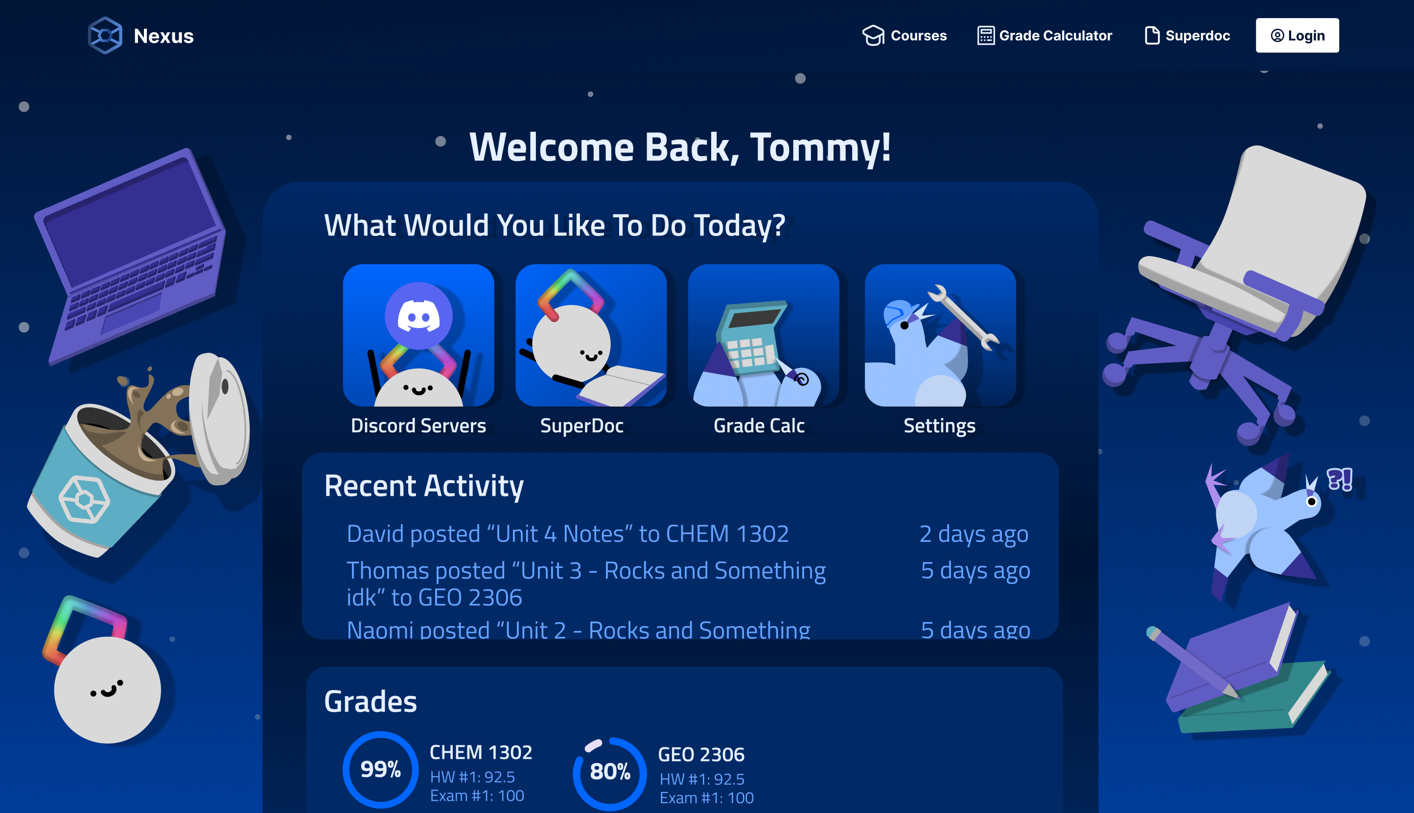
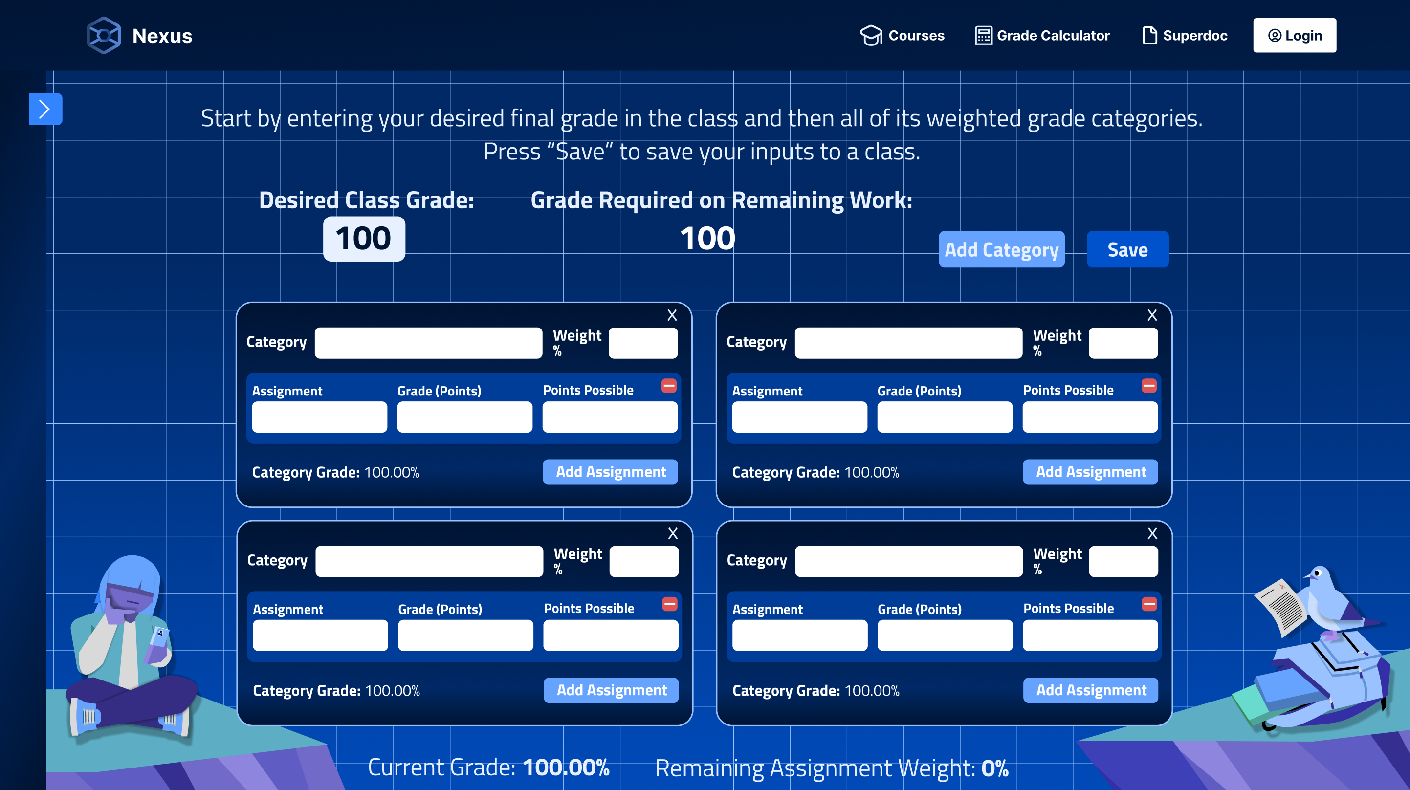
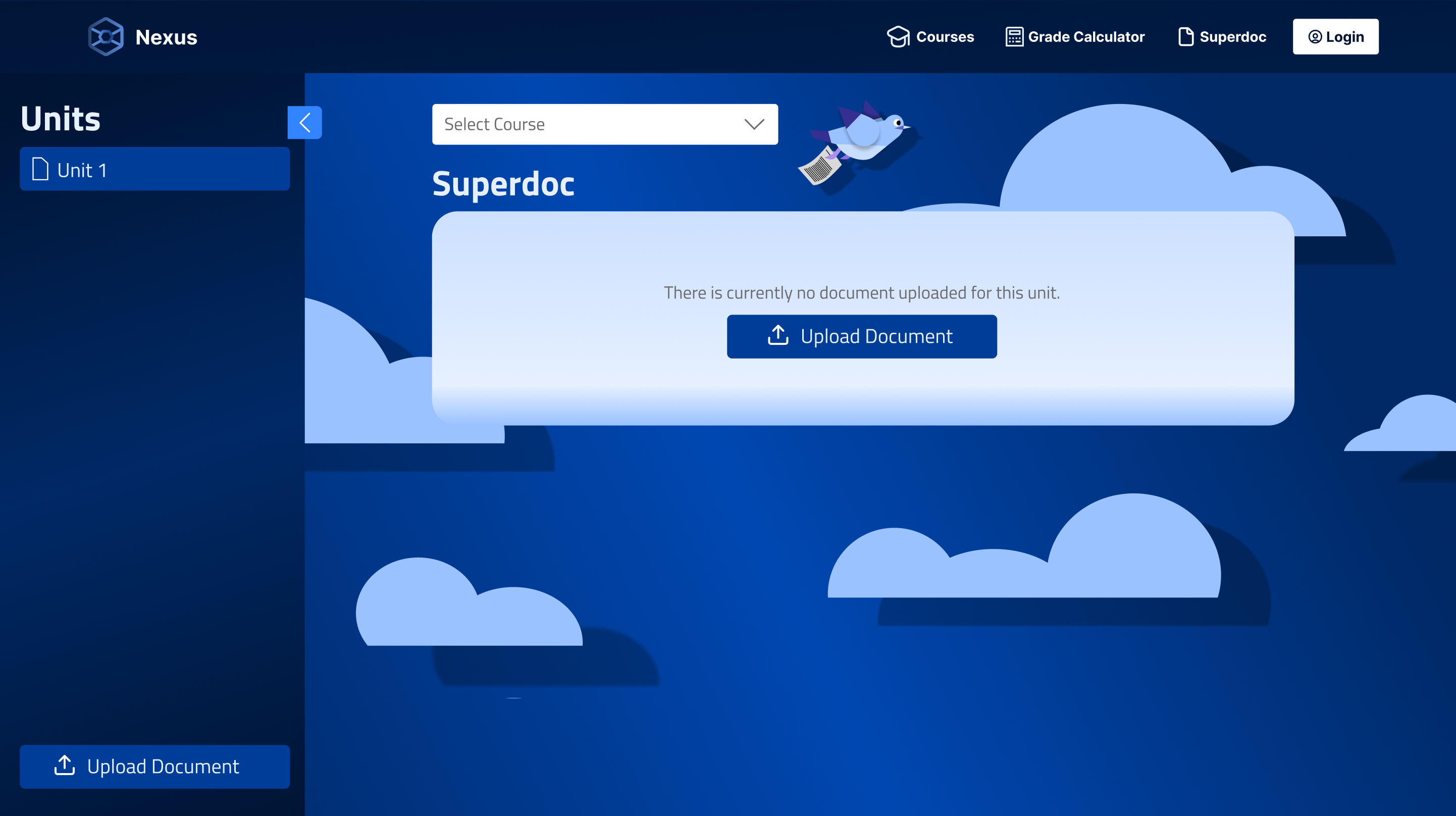
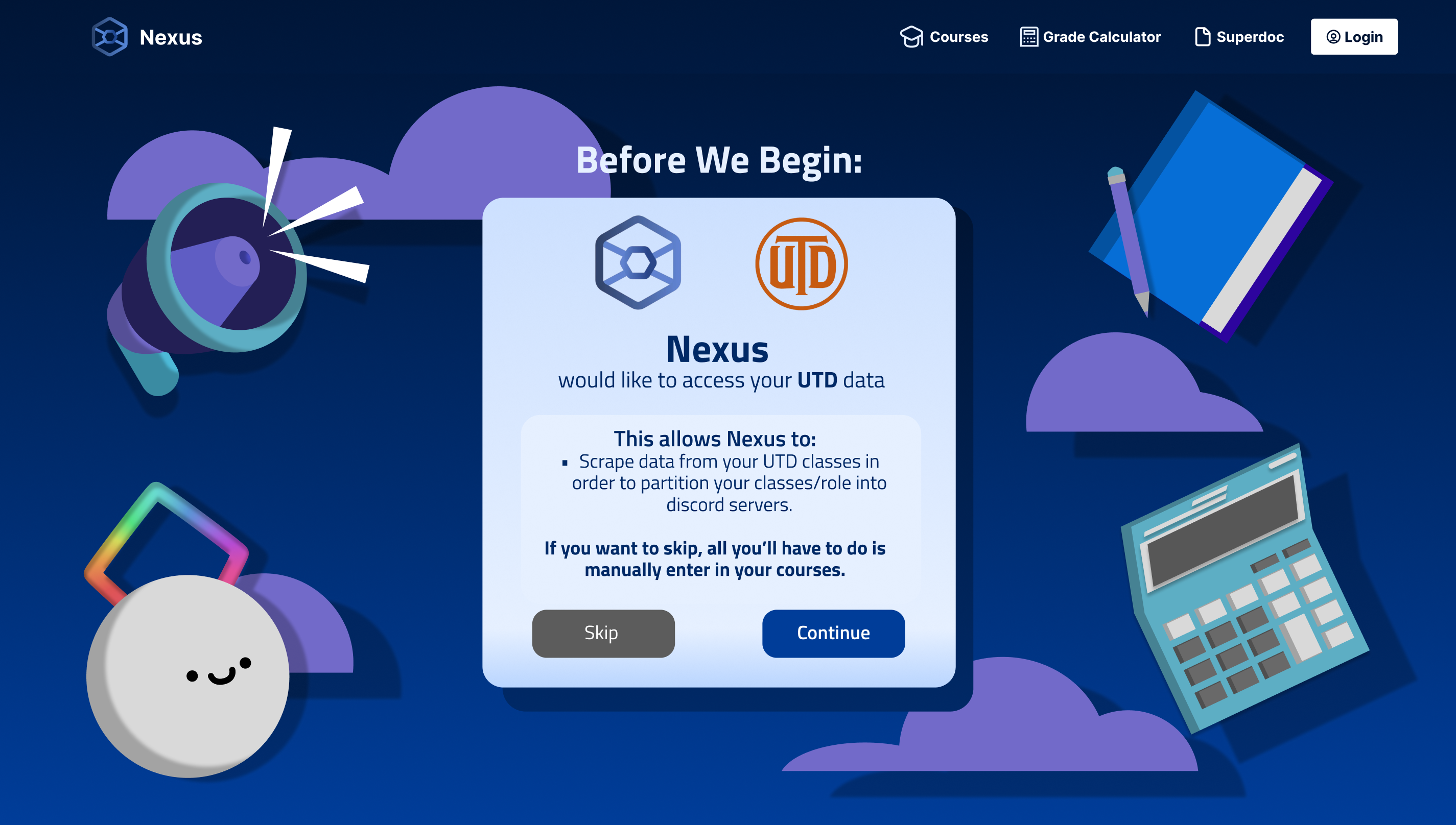


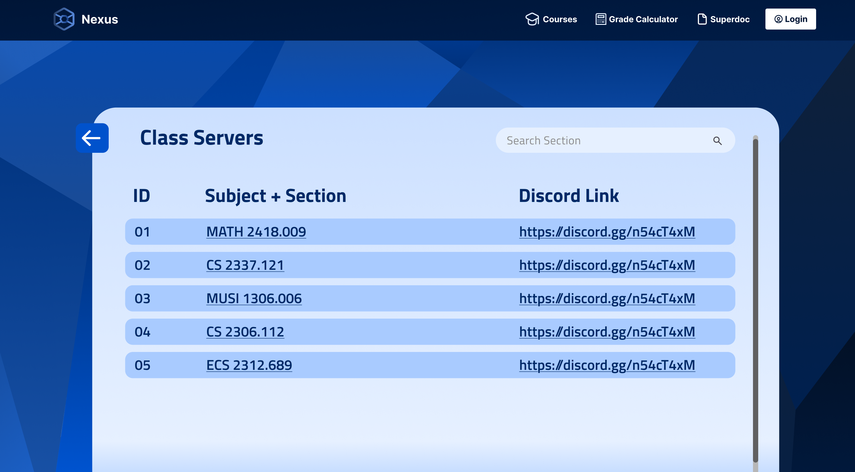
 One of the earliest pages made to test out the concepts and how it would mesh with the existing UI at the time.
 Better view of the previous image's background. A 'crystal' theme that is invoked by the geometric design of Nexus.
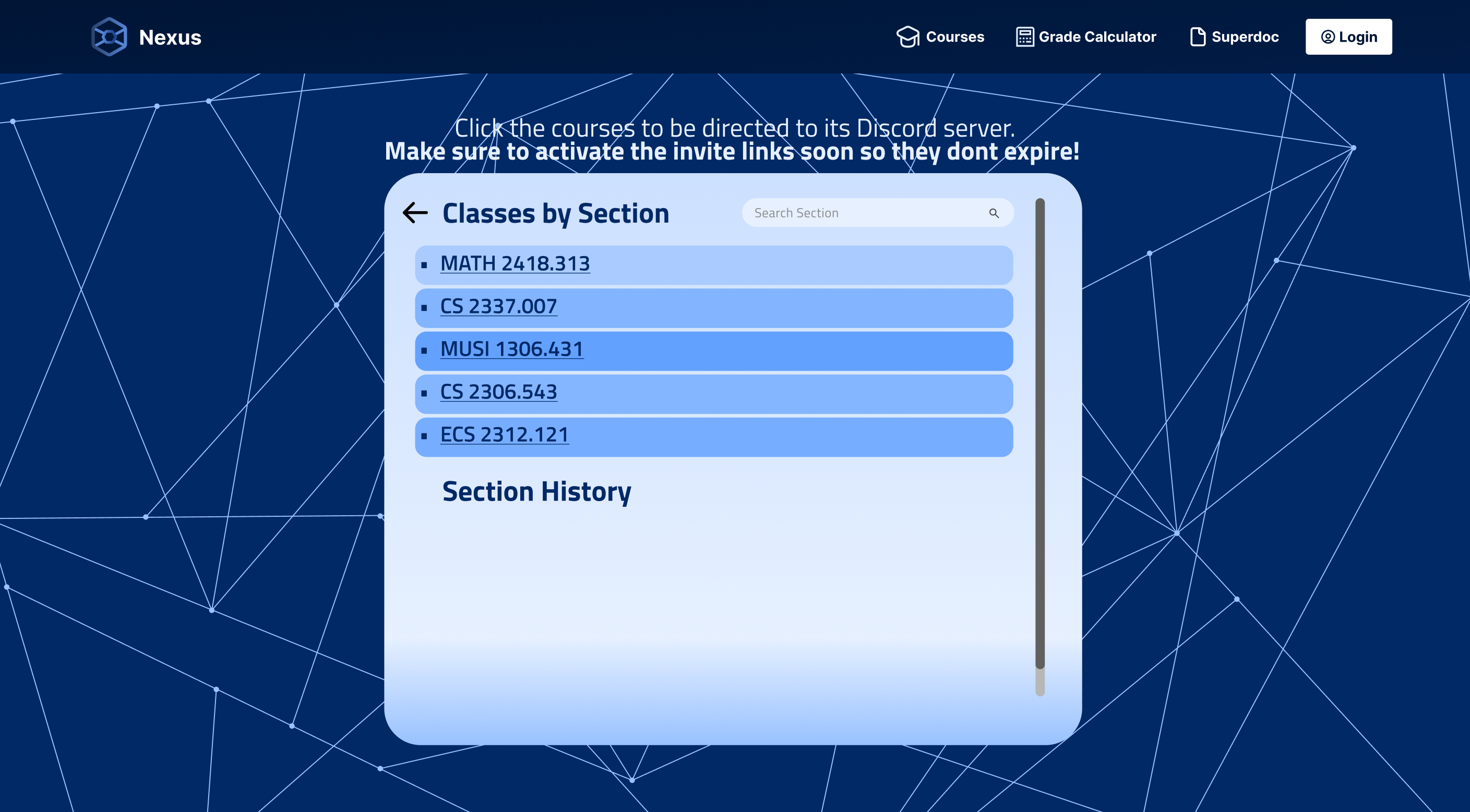 Another early page, the background is meant to represent Nexus quite literally, where it's a connection of multiple points and lines.
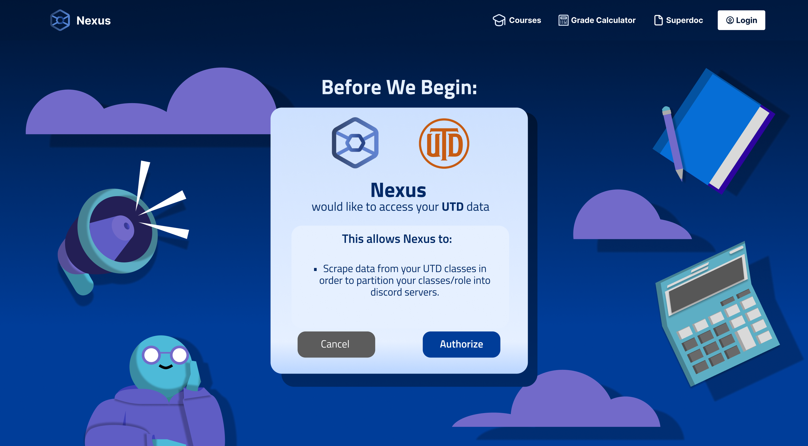 The fan favorite design! An attempt to make a more identifiable style through more playful graphics.
 Custom loading animation I made that also takes the word Nexus literally, where the logo grows and disperses out to make connections.
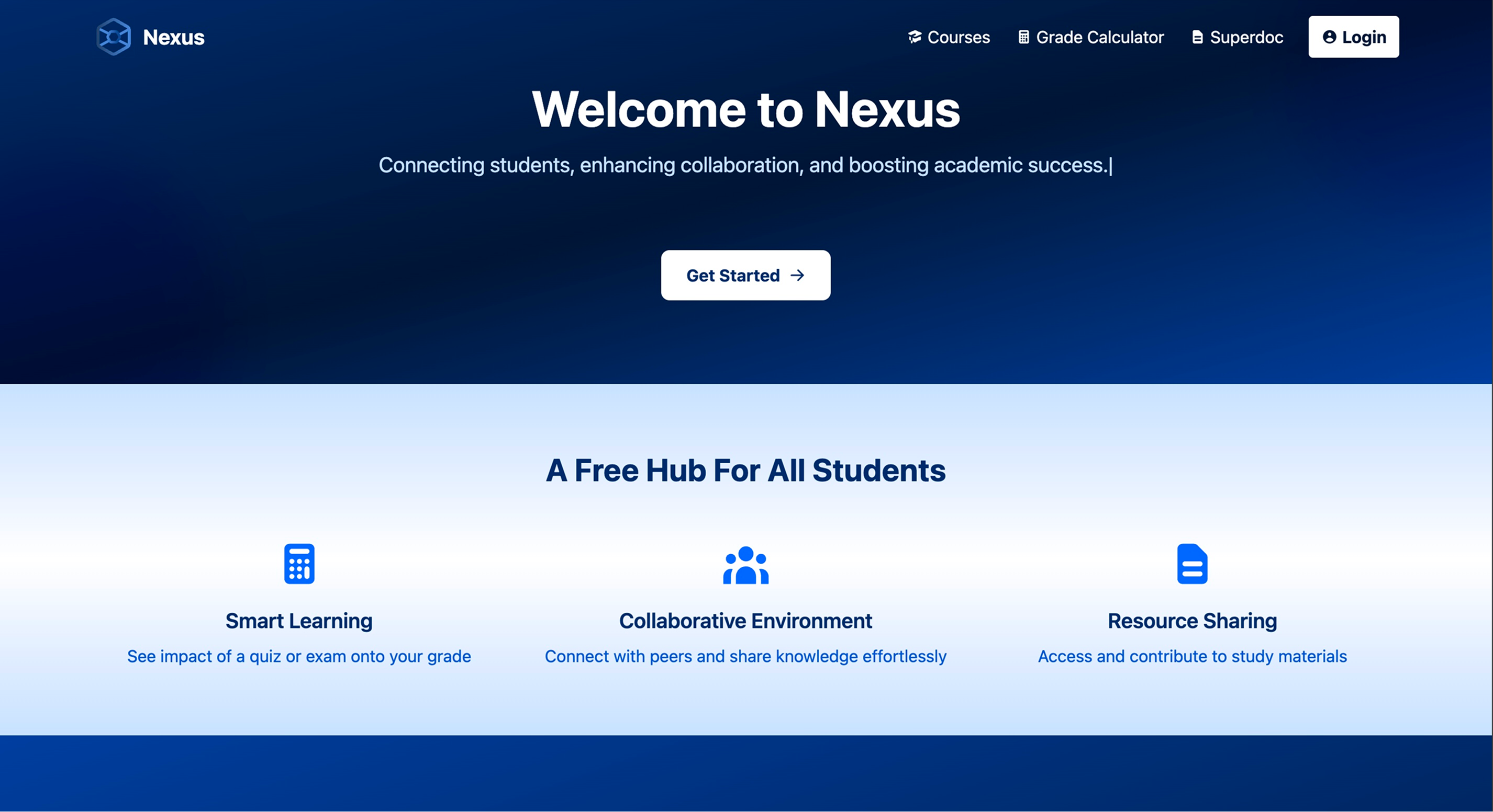 Before: Landing Page
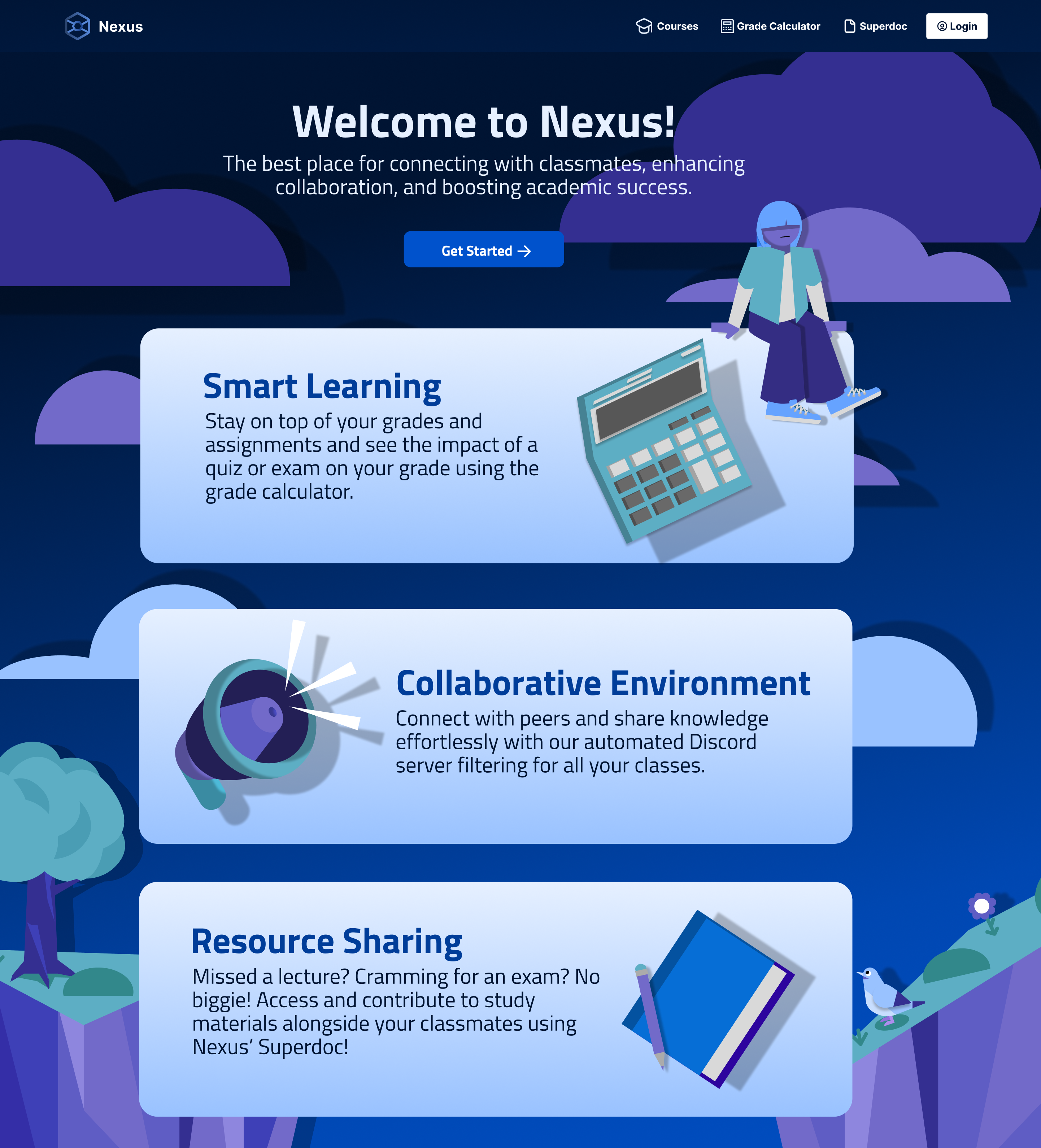 After: Landing Page
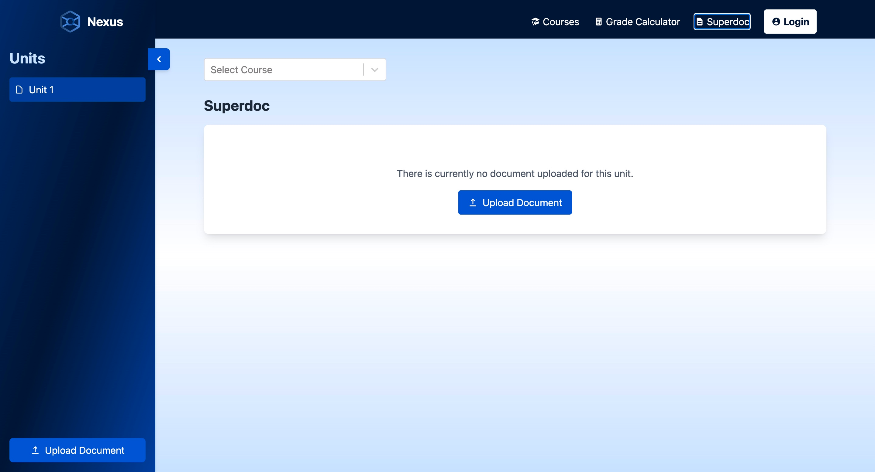 Before: Superdoc
 After: Superdoc
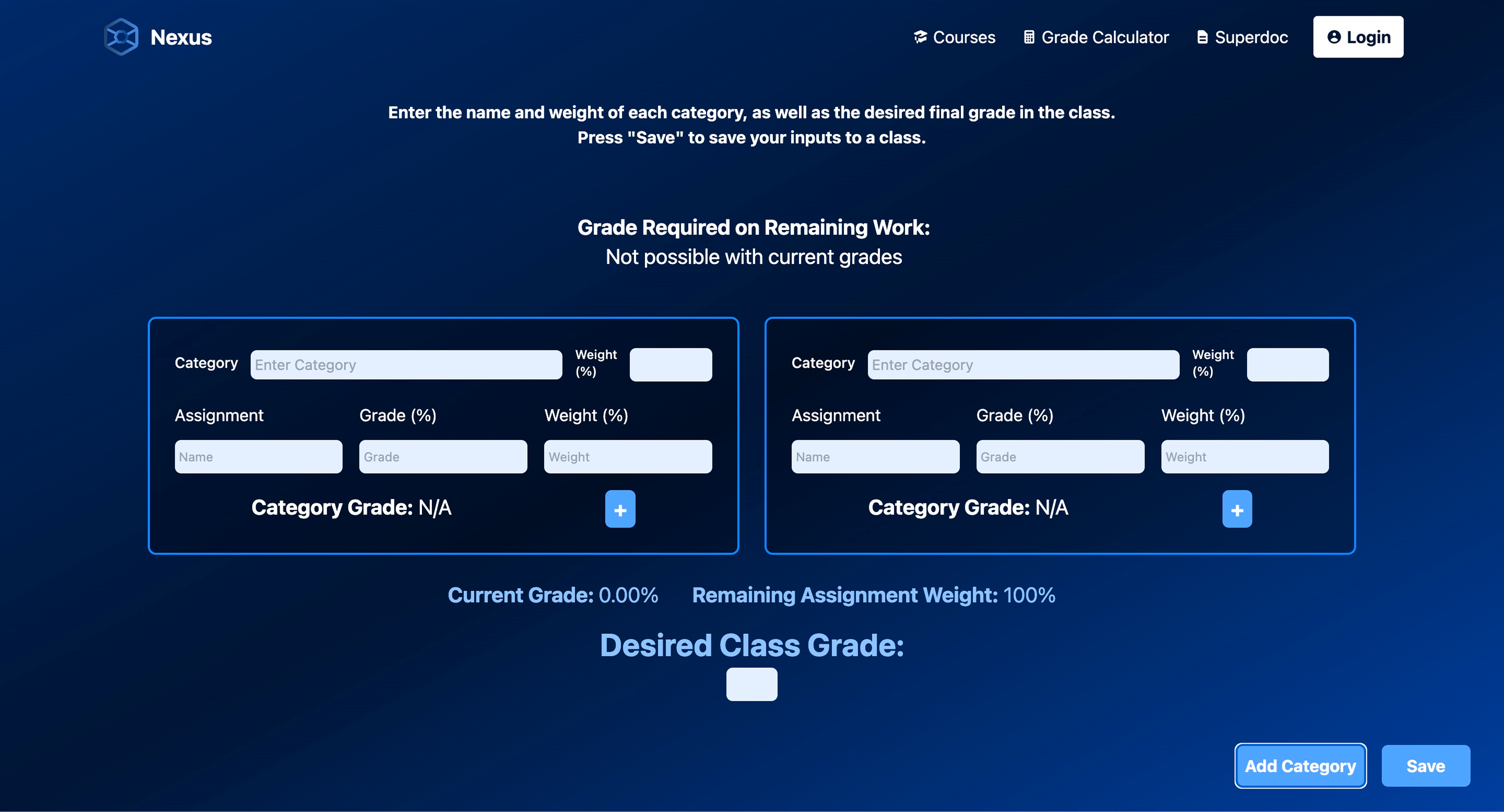 Before: Grade Calculator
 After: Grade Calculator